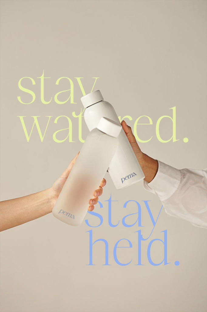
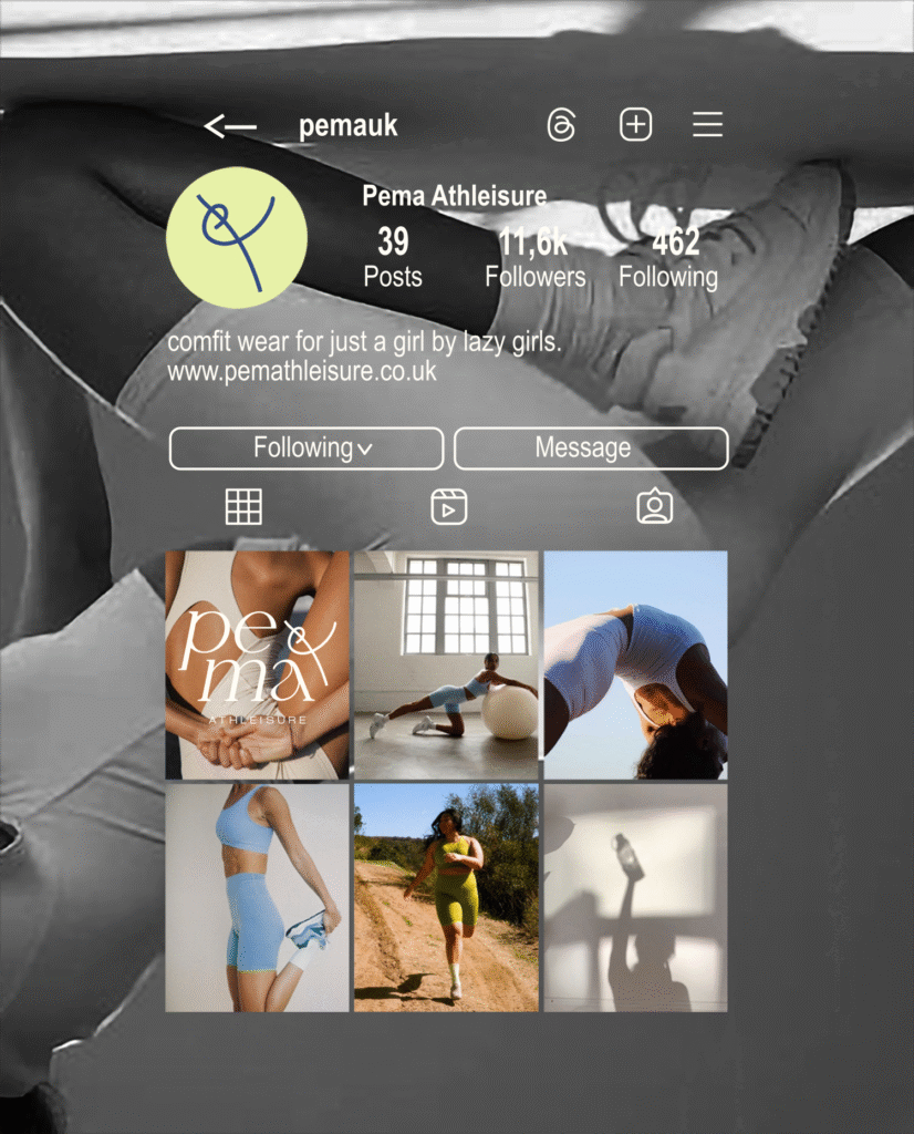
→ Making Comfort Aspirational Again.
[ Portfolio Piece 001 ]
by SVNTY ONE
✺ Client: Pema Athleisure
Location: United Kingdom
Industry: Apparel / Activewear
Services: Brand Strategy, Identity Design, Launch Strategy
Year: 2025
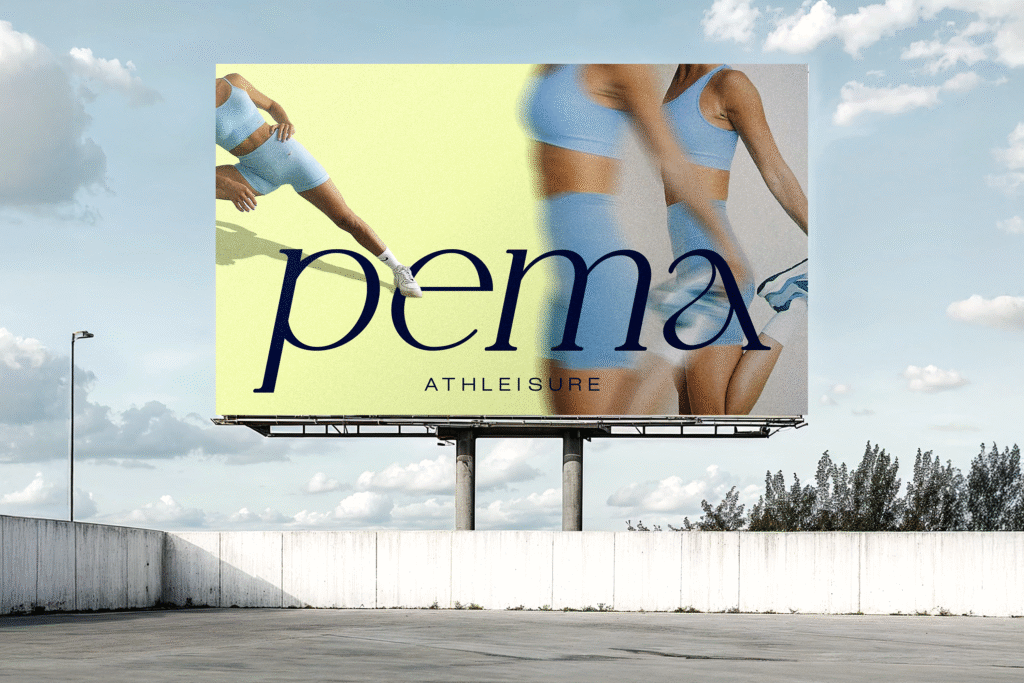
Overview
Pema is a contemporary athleisure brand designed for bodies in motion. Built for women, but not only.
It speaks to an emerging pace – where ambition meets presence.
We partnered with Pema to create a brand system that moves – visually, verbally, and emotionally.
From identity to launch strategy, the goal was to articulate a new definition of comfort: one that’s dynamic, refined, and intentional.
The Problem
In a saturated athleisure market, most brands speak in binaries: hard or soft, masculine or feminine, performance or ease.
Pema sits in the space between.
It needed a visual and verbal identity that could hold this tension – without compromise or noise.
Not activewear for downtime. Not loungewear for performance.
Our Response
We made comfort move.
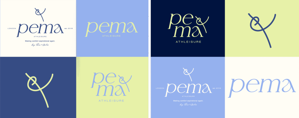
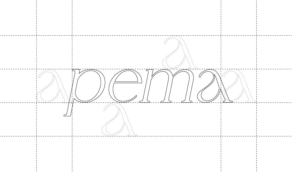
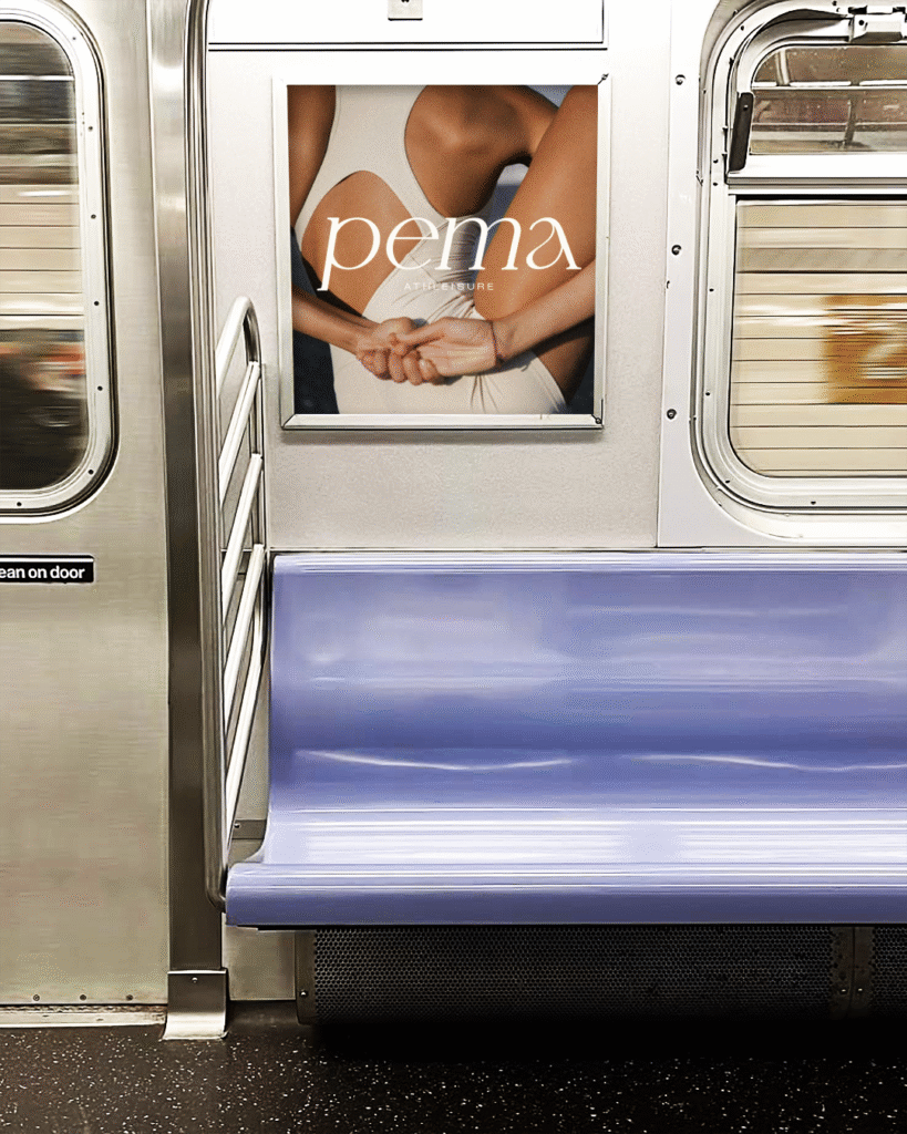
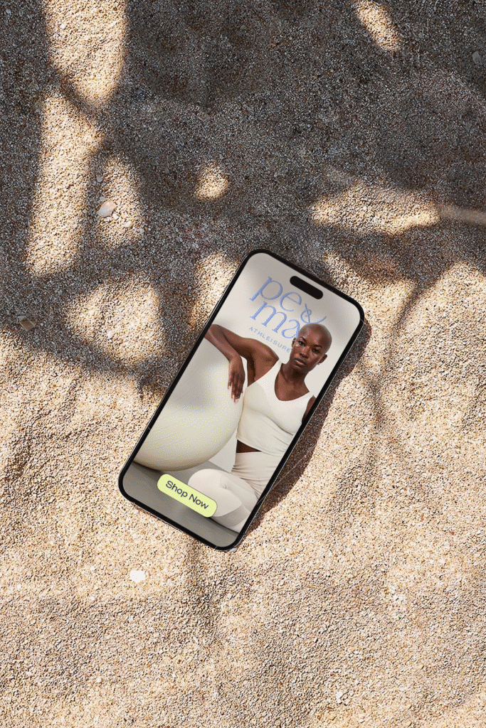
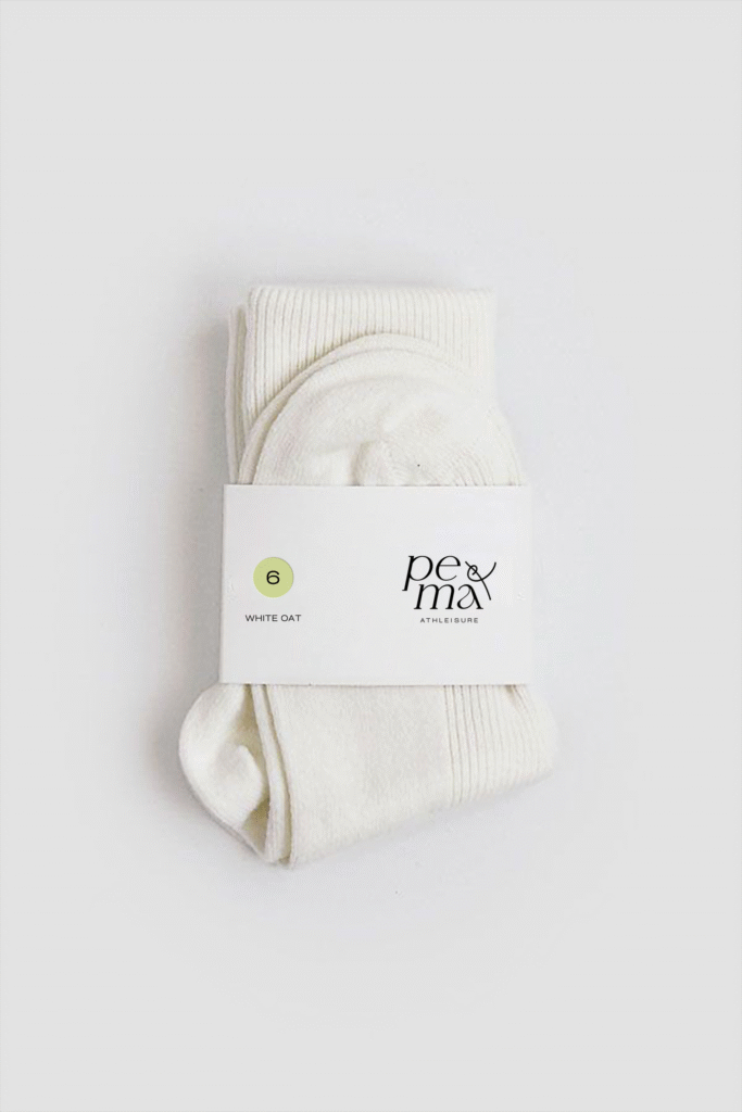
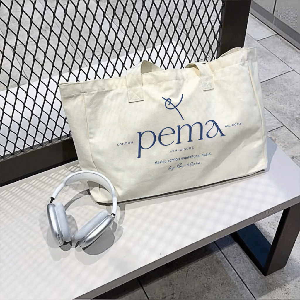
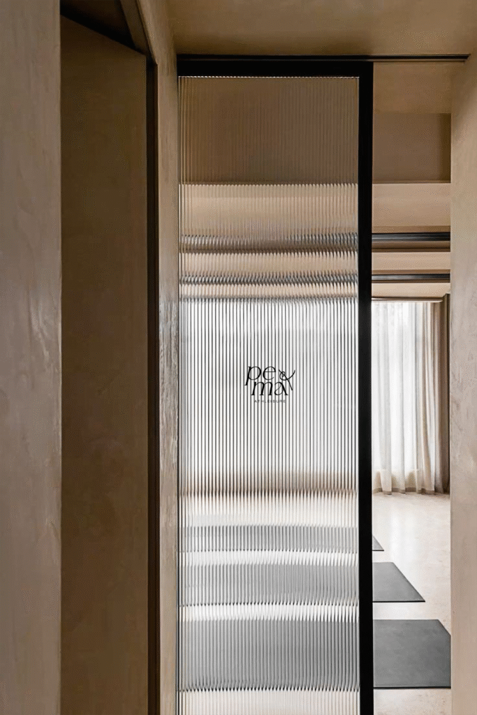
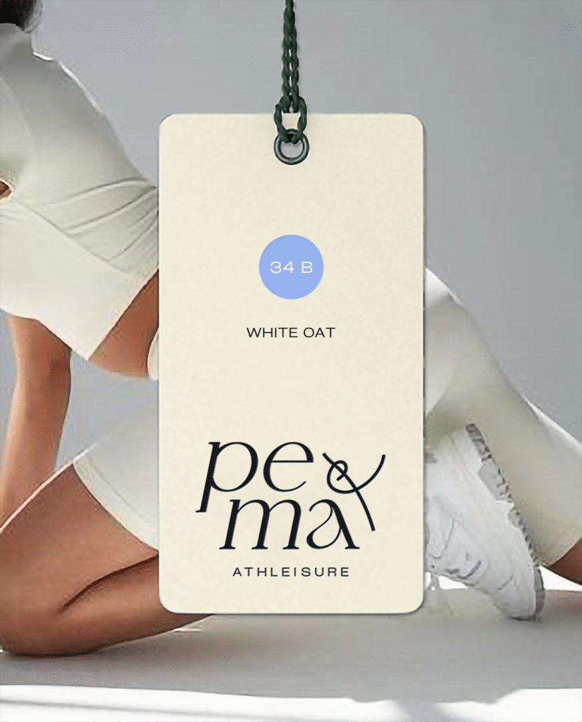
Pema’s identity system is built around contrast and control – A custom monoline “P” – which lends itself to the ampersand – anchors the brand’s visual language and sense of belonging, you & Pema. A minimal serif logotype reflects both clarity and quiet confidence. The color story moves between neutrality and signal.
Every choice was made to balance restraint and presence. Movement without rush. Boldness without volume.
→ Brand ( Foundation )
( Name ) → Pema – derived from Swahili, meaning “beloved.”
The name remains a quiet throughline. Not foregrounded as origin. Framed as intention.
( Tagline ) → “Making Comfort Aspirational Again.”
A refinement of the initial ambition, inspired by motion. Less promise, more presence.
( Core Themes ) → Motion as presence, Non-performative ambition
Identity System
LOGO MARK
Custom swoop “P” (sans the top quarter) as signature. Fluid, continuous, human.
→ Designed to function as icon, stitch tag, and motion mark.
TYPEFACE
Gentle serif. Timeless, editorial, unobtrusive.
→ Designed for longevity across print and digital.
PALLETTE
Day Blue, Signal Green, Washed Denim, Marine Blue, Tanned White, Slate Black
→ Founder-inpired, a visual rhythm – cool, grounded, punctuated.
Launch Strategy
TONE
Editorial, minimal, deliberate – We stripped excess from the visual language.
→ No slogans. No performance clichés. Only clarity and feeling.
CAMPAIGN
‘Comfitable Strength’
→ A study in balance. Visuals centered on real movement – nothing exaggerated, nothing passive.
EXECUTION
– Staggered digital rollout across owned channels
– Voice-driven visual storytelling
– Modular content system: movement studies, tonal statements, founder POV
– Lookbook design + launch assets for press, social, and product
✺ The Result
A brand system that adapts to the wearer, not the other way around.
A visual language that moves with restraint.
A brand that invites presence – in body, in rhythm, in intention.
Pema now owns a clear visual and verbal space.
( Modern. Fluid. Unforced. )
→ Designed for movement. Defined by control.
